Introduction
Every milestone deserves a moment of reflection — and for Skyline Builders, celebrating 30 years in Kerala’s real estate landscape wasn’t just about numbers. It was about people.
When we at The Vertical Story were brought in to create the key visuals for Skyline’s “30 Years of Doing It Right” campaign, the brief was both poetic and powerful:
“Capture generations who’ve grown with us — all looking out through the same window.”
A simple window became the heart of the concept — a frame within a frame, symbolizing how Skyline has shaped homes, memories, and dreams across time.
The Concept: One Window, Many Stories
The agency and client teams wanted a unifying visual — something symbolic yet instantly relatable. A window became the metaphor for “home,” “dreams,” and “continuity.” Each generation — from grandparents to young couples to children — would appear within this window frame, interacting naturally, looking outward as if to the future. The goal was to capture emotion through simplicity — no grand architecture, no digital gimmicks, just human connection. Our job was to build this world from scratch — quite literally.
Pre-Production: Designing the Frame of Legacy
Set Design & Construction
We didn’t shoot in an actual home. The “window” you see was a custom-built set constructed in the studio — measured, painted, and lit to perfection.
The team designed it to resemble Skyline’s signature architectural minimalism: clean lines, soft shadows, and an inviting warmth that mirrors the brand’s design language.
We played with proportions carefully — large enough for real people to interact, yet balanced enough to feel intimate when framed. The wall color was tested through multiple samples to get that warm beige tone that complements both skin tones and Skyline’s red branding.
2. Lighting Tests
Lighting was critical because the image had to feel like daylight streaming into a home — not flat studio light.
We created a diffused daylight effect using a large octa softbox placed outside the “window” frame. To add depth, a subtle kicker light was introduced from camera-left to simulate natural reflections. Every shadow was designed — soft, directional, believable.
The final lighting setup was tested across three different age groups to ensure consistent color temperature and tonal mood.
The Shoot: Capturing Generations Through One Frame
On shoot day, the set looked deceptively simple — a clean beige wall, a white window frame,
and a few paper planes ready to fly. But behind that simplicity was a choreography of timing,
coordination, and technical control.
We photographed three separate family scenarios — each representing a different
generation:
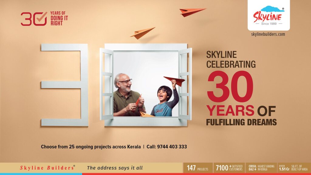
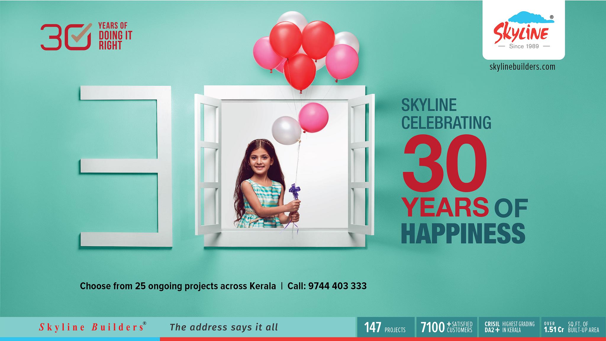
- The Grandparent and Grandchild Frame – capturing nostalgia, laughter, and warmth.
- The Young Couple Frame – filled with optimism and togetherness.
- The Child’s Frame – symbolizing dreams taking flight, literally through paper planes.
To maintain visual consistency, we kept the camera locked on a fixed rig — same distance, same lens, same perspective. Only the subjects and props changed. This approach allowed the visuals to align seamlessly across campaign formats, from billboards to print to digital.
Challenges Behind the Simplicity
Advertising photography, especially one that seems “effortless,” often hides layers of complexity. This campaign was no exception.
1.Balancing Real Emotion with Precision
Working with multiple generations meant balancing authenticity with visual harmony. The key was to capture real interactions, not posed smiles. We encouraged natural movement — conversations, laughter, the spontaneous act of
throwing paper planes — all timed with the camera bursts to freeze genuine expressions.
2.Set Limitations
Since the set was built in-studio, depth was limited. Achieving a sense of space beyond the window required careful lighting gradients and perspective management.
We used a shallow depth of field and controlled fall-off to make the “outside world” feel naturally bright.
3.Colour Management
The beige wall and white window seemed simple until post-production. The tones had to remain consistent across print media — from hoardings to brochures — where even a small shift in warmth could alter the brand feel.
We used a calibrated color workflow from capture to retouch, ensuring the campaign’s warm tone carried seamlessly across all outputs.
Post-Production: From Studio to Skyline
The post-production phase, led by The Vertical Story’s retouching team, focused on refining rather than reinventing.
- Colour Grading: A soft golden warmth to align with Skyline’s celebratory tone.
Skin Tones: Balanced natural textures, especially across age differences. - Compositing: Minor clean-ups to maintain focus on expressions and props.
- Brand Integration: Ensuring the logo red (Pantone matched) complemented the overall palette.
The result was a set of visuals that felt cinematic yet grounded — bright, emotional, and unmistakably Skyline.
Why This Campaign Worked
The success of the Skyline 30 Years campaign wasn’t about complexity — it was about clarity.
A window, a gesture, a look — that’s all it took to summarize three decades of doing it right.
From a photography perspective, the power lay in restraint. Every choice — lighting, colour, framing — was deliberate yet subtle. Nothing distracted from the human connection at the heart of the brand’s story.
The final visuals didn’t just celebrate 30 years of construction — they celebrated 30 years of trust, family, and fulfillment.
Key Learnings from the Skyline Campaign
- Simplicity takes planning — minimalism only works when every detail is intentional.
- Consistency across generations creates timeless imagery.
- Lighting design can tell emotional stories without needing elaborate backdrops.
- Building trust with subjects on set brings out real warmth that no direction can fake.
Conclusion: Framing the Future
This Skyline Builders campaign was more than an ad shoot — it was a visual time capsule. A single frame that held three decades of emotion, homecoming, and human stories. For me, it was a reminder that great advertising photography doesn’t shout — it feels.
And in this case, it felt like home. When I look at those final frames — laughter frozen in time, paper planes in mid-air — I see not just a celebration of a brand, but of everything it represents: heritage, hope, and the beauty of doing it right.
Written by: Naseef Gafoor – Advertising Photographer, Kochi
Produced by: The Vertical Story – Creative Studio for Advertising & Brand Visuals
Keywords: advertising photography in Kerala, campaign photography, Skyline Builders 30 years, real estate photography India, commercial photographer Kochi, studio set photography, The Vertical Story, brand storytelling visuals.