Behind the scenes of how we captured flavor, texture, and freshness for vehicle branding. Food photography is often romanticized — the gentle steam, the perfect glaze, the magical light falling on a plate just right. But behind that one final image, there’s an entire process — a dance between planning, styling, lighting, and storytelling.
Our recent campaign for Brillar was a great example of this. It was fast-paced, collaborative, and a reminder that when you combine the right people and preparation, even a one-day shoot can produce visuals strong enough to travel across an entire city — literally, on moving vehicles.
The Brand and the Brief
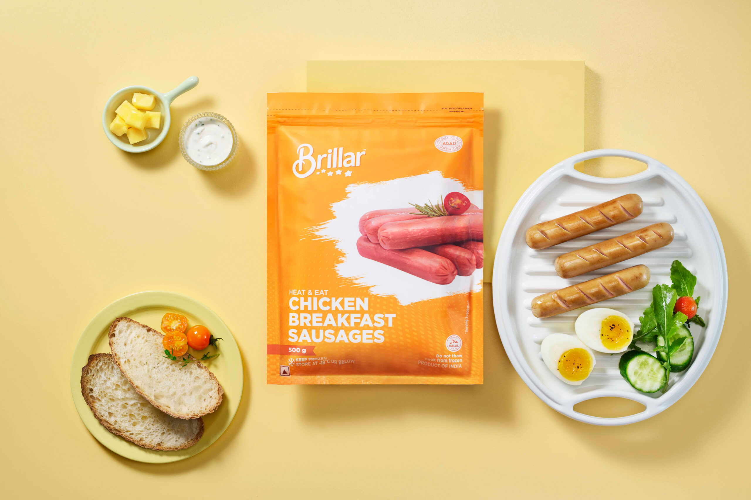
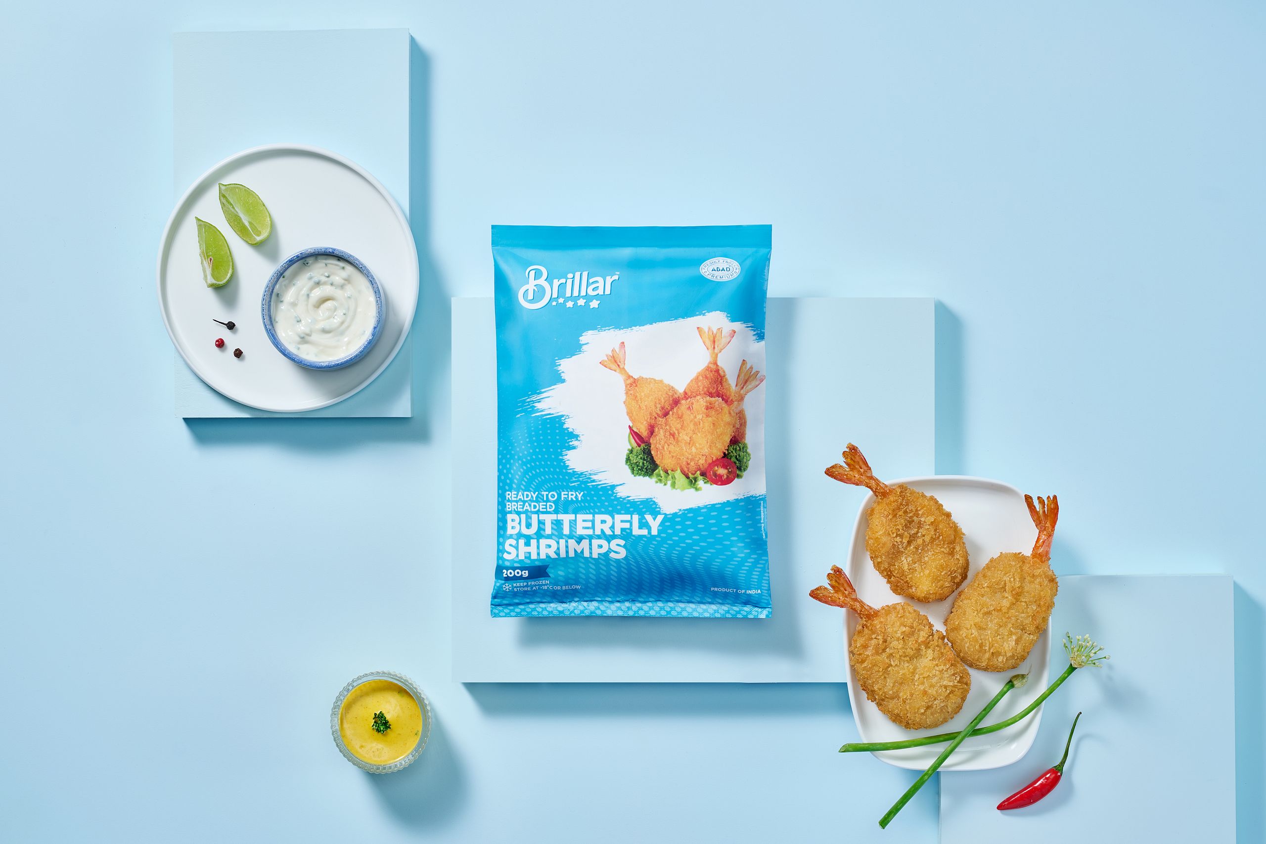
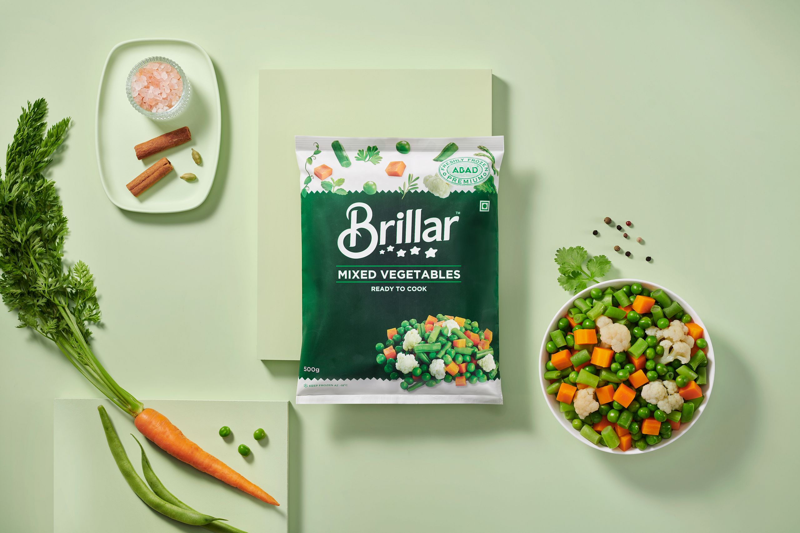
Brillar (a brand from the ABAD group) is known for its ready-to-fry and heat-and-eat range of foods — products that promise convenience without compromising taste.
They approached us with an interesting brief:
“We want food visuals that look appetizing and premium, something that can live beautifully on our delivery vehicles.”
That meant every image needed to hold its visual power even when blown up on a large-scale vehicle wrap. The pictures had to scream freshness, flavor, and quality — all while being instantly readable from a distance. We at The Vertical Story took it on as both a creative and technical challenge.
Our goal: to shoot a complete set of food photographs in one day, ready for vehicle branding and marketing use.
Pre-production: Building the Foundation
If there’s one secret to pulling off a tight shoot, it’s this — pre-production is everything.
Before a single light was switched on, our day started long before the actual shoot day.
1. The Visual Moodboard
We built a detailed moodboard that balanced taste appeal and brand clarity.
The core visual direction revolved around three pillars:
Bold composition – strong enough to read at a glance on a moving vehicle.
Authentic texture – no artificial “plastic food” look; real food with real character.
Colour harmony – warm tones to evoke freshness and appetite, matching Brillar’s brand palette.
We wanted the food to look like it just came off the pan glistening, crisp, and full of life.
2. Understanding the Brand’s Voice
Brillar’s packaging already had a modern, bold aesthetic. We wanted to complement that visual language, not compete with it. So our approach leaned toward minimalistic props and clean composition. No over-decorated scenes — just good food, shown honestly.
Collaboration: The Team Behind the Shoot
A one-day project only works when every person on set knows exactly what they’re doing.
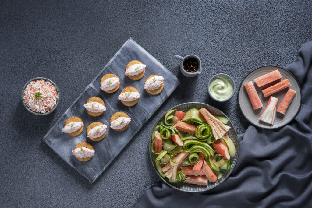
- Food Styling by Anupama: She was the heart of the setup. Food styling for photography is an art form in itself — it’s about making dishes look fresh for hours under hot lights. She prepped, styled, and detailed every frame with precision — brushing oil for gloss, layering garnish for dimension, and building compositions that felt natural yet art directed.
- Post-Production by BSR: Once we wrapped shooting, BSR handled colour correction, retouching, and preparing print-ready versions for the vehicle wraps. His role was crucial — ensuring the textures stayed sharp even at billboard scale, and colours stayed consistent across digital and print formats.
The Photography Process
The actual shoot might have lasted a single day, but every element was engineered for efficiency.
Lighting Setup
We used controlled studio lighting to keep textures alive and shadows balanced.
Soft diffused light gave a natural feel, while a narrow backlight helped bring out the crispness — think of that golden edge on a perfectly fried cutlet.
We shot in tethered mode (directly to monitor), so every frame could be reviewed in real time for colour, composition, and print safety. For vehicle branding, clarity is key. So, each image was composed with breathing space around the food — leaving room for logos, text, or wrap elements.
Composition and Angles
Every product got its own frame personality.
For Brillar’s crispy ready-to-fry items, we shot slightly top-down — to highlight texture and detail. For gravies and cooked dishes, we used a 45-degree perspective that mimics the diner’s point of view.
The idea was to make the viewer hungry, but also make sure the photo worked practically for layout design.
Colour and Texture Management
One big challenge with ready-to-cook food is maintaining the freshly cooked illusion.
Anupama’s styling brought out just the right amount of gloss and steam. Meanwhile, I focused on contrast control — ensuring the browns didn’t go muddy and the greens stayed lively.
We also used real ingredients — fresh spices, herbs, and lemon wedges — to create a sensory context. You don’t just see the food; you feel what it might taste like.
Post-Production: Finishing with Precision
After the shoot, the files went to BSR for post. Here’s where the magic really crystallized. He colour-graded each frame with a focus on realism — keeping the whites neutral and the tones warm. Any minor imperfections (a stray crumb, a reflection spot) were carefully cleaned without over-editing.
Because these images were meant for vehicle branding, BSR had to ensure:
1. High-resolution output: Sharp enough to print at several meters wide.
2. Colour consistency: Vehicle wraps use CMYK vinyl printing, so he profiled images for accurate reproduction.
3. Background separation: Some frames were clipped and isolated, so designers could easily place them into different layouts.
The result? Images that looked vibrant both on screen and in real-world light — whether it’s a delivery van parked under the sun or moving through city traffic.
The Creative Philosophy Behind It All This project reminded us why food photography isn’t just about lighting and lenses — it’s about storytelling through flavour. For Brillar, every shot had to communicate three emotions in seconds:
Appetite. Trust. Familiarity.
People don’t have time to analyse a moving van image. So we needed that split-second impression to be clear — “That looks delicious, that’s Brillar.”
We approached the food as a brand ambassador — not just a dish. The golden crisp of a cutlet or the steamy surface of a gravy bowl wasn’t just texture; it was identity. That’s what separates advertising food photography from a casual food shot — every crumb, every droplet has a role in the story.
Challenges We Solved
No creative project is ever smooth, especially with one-day timelines.
A few things we had to handle smartly:
- Temperature control: Keeping food looking fresh for long hours in a studio environment is tricky. We worked in smaller batches and styled in rotation to keep things camera ready.
- Colour matching for print: What looks perfect on a monitor can print differently on vinyl. We ran quick test prints to make sure the reds and browns translated accurately.
- Limited time: We planned each frame meticulously so the day didn’t feel rushed. Preparation saved us hours. Every challenge was balanced by teamwork — everyone focusing on their domain without stepping on each other’s space.
Why Vehicle Branding Photography Is Its Own Art
Shooting for vehicle branding isn’t like shooting for Instagram or billboards.
Here, your photo is constantly moving, viewed at angles, and seen for seconds.
That means:
- The food needs strong contrast and clear edges.
- The background must be clean and adaptable to curved surfaces.
- The lighting has to hold detail even when bright sunlight hits the print.
In many ways, it’s closer to industrial design than photography — you’re designing how an image performs in motion. For Brillar, these photos became the face of their fleet — carrying their story through Kerala’s roads, from markets to homes.
Keywords That Define the Project
If we had to distill the project into key creative themes, it would be:
- Food Photography in Kerala
- Commercial Food Styling
- Vehicle Branding Photography
- Studio Food Photography Workflow
- Frozen and Ready-to-Eat Product Photography
Advertising Photography for Food Brands
These are not just search keywords — they’re exactly what the project embodied.
A strong, efficient, brand-consistent food photography process, executed within a single day, yet built to last across multiple platforms.
What Made This Shoot Special
The joy of this project wasn’t just in seeing the final vehicle branding. It was in the energy of collaboration — everyone on set working with shared focus.
Anupama’s food styling brought warmth and honesty. BSR’s post-production elevated precision and polish. And the Brillar team trusted our creative instincts, which always makes the process richer. At the end of the day, as we watched the final retouched images projected at full size — it was satisfying to realize how much story can fit into a single plate of food.
Closing Thoughts
Every shoot teaches something new. The Brillar project reaffirmed something I deeply believe in as a photographer: constraints create creativity. Working within one day pushed us to refine every decision — from lighting angles to prop choices — and that discipline translated into powerful, brand-ready images. Today, when I see a Brillar van on the road, there’s a quiet thrill.
That picture of sizzling food, crisp and vivid on the move — it’s more than a photograph. It’s the memory of a day when a team came together to make flavour visible.
Written by Naseef Gafoor, advertising and hospitality photographer based in Kochi.
Produced by The Vertical Story – a creative content studio crafting brand stories through photography and film.
Keywords: food photography in Kerala, vehicle branding photography, commercial food styling, food photography behind the scenes, advertising photographer Kochi, ready-to-eat product photography, frozen food shoot, The Vertical Story, Brillar campaign 2025.